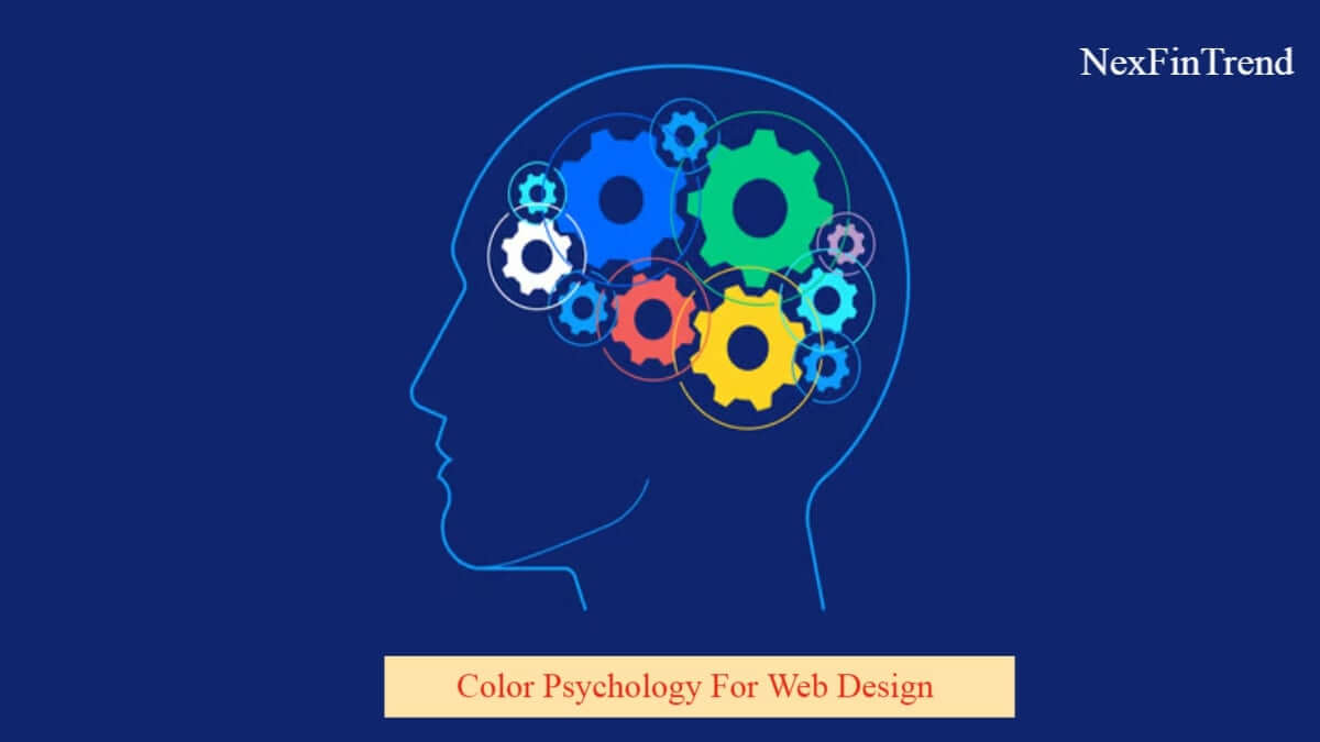
Colors aren’t just aesthetic choices—they’re powerful psychological tools that influence user behavior and decision-making. Understanding color psychology can transform how visitors interact with your website and ultimately impact your conversion rates.
Red: The Urgency Creator Red stimulates excitement and creates a sense of urgency. That’s why you’ll see “Sale” buttons and limited-time offers in red. However, overusing red can create anxiety, so use it strategically for call-to-action buttons and important notifications.
Blue: The Trust Builder Blue evokes feelings of trust, security, and professionalism. It’s no coincidence that banks, tech companies, and healthcare websites predominantly use blue. Studies show that blue can actually lower heart rate and create a calming effect on users.
Green: The Growth Motivator Green represents growth, nature, and prosperity. It’s perfect for environmental websites, financial services, and health-related content. Green also has the unique advantage of being easy on the eyes, making it ideal for websites with heavy text content.
Orange: The Friendly Energizer Orange combines the energy of red with the happiness of yellow. It’s approachable and enthusiastic, making it perfect for creative agencies, fitness brands, and entertainment websites. Orange buttons often see higher click-through rates than traditional blue ones.
Purple: The Luxury Indicator Purple has long been associated with royalty and luxury. Modern brands use purple to convey creativity, wisdom, and premium quality. It’s particularly effective for beauty products, creative services, and high-end technology.
Practical Implementation Tips:
- Use contrasting colors for better accessibility
- Test different color combinations with your target audience
- Consider cultural differences in color perception
- Maintain consistency across all brand touchpoints
- Use color to guide the user’s eye through your content hierarchy
The key to successful color implementation is understanding your audience and testing different combinations to see what resonates best with your specific users.